✦ Brand Identity ✦ Digital Design ✦ Sensory Design ✦ Animation
Reinventing a household name for edgeless growth.
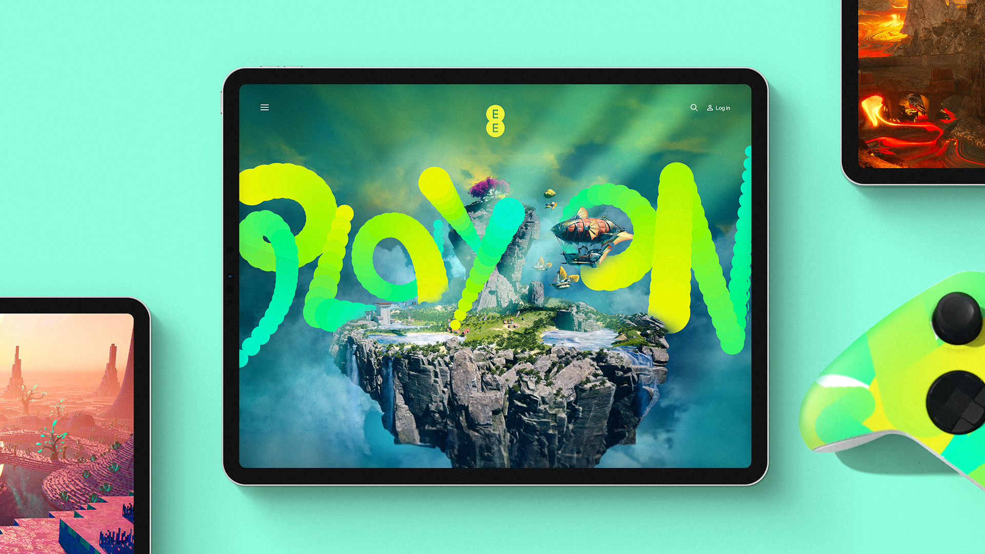
The BT group had ambitions of being the most personal and customer-focused technology brand in the UK. Their mobile focused brand EE needed a host of new tools to relaunch with a bigger, broader, bolder offering for customers, there are focus areas around Home, Work, Game and Learn and early propositions around home security, enhanced TV services, new network personalisation technologies and a new gaming destination.
Client
Credits
BT Group (UK)
Agency: ZAG
CD: Neil Cummings & Daniel Green
Product design partner: Tej Chauhan
Sound design partner: Father
Type design partner: Colophon
Illustration partner: P.I.C studio
Animation: SR partners, Rich Coldicott,
Liam Corner, Matt Fowler
Scent design: Prosody London
Haptic design: Goya Studio
Brand Film
To support these growth ambitions now and next, we boosted the brand with dialled-up distinctiveness and the extra elasticity needed to cut through in new categories.
We took the brand back to its core component, the smart dot, and gave it a new, simpler aesthetic and defined new behaviours to allow the brand as much playful, multi-channel utility as possible.
Suddenly, EE could flex and express itself in new ways to new audiences.
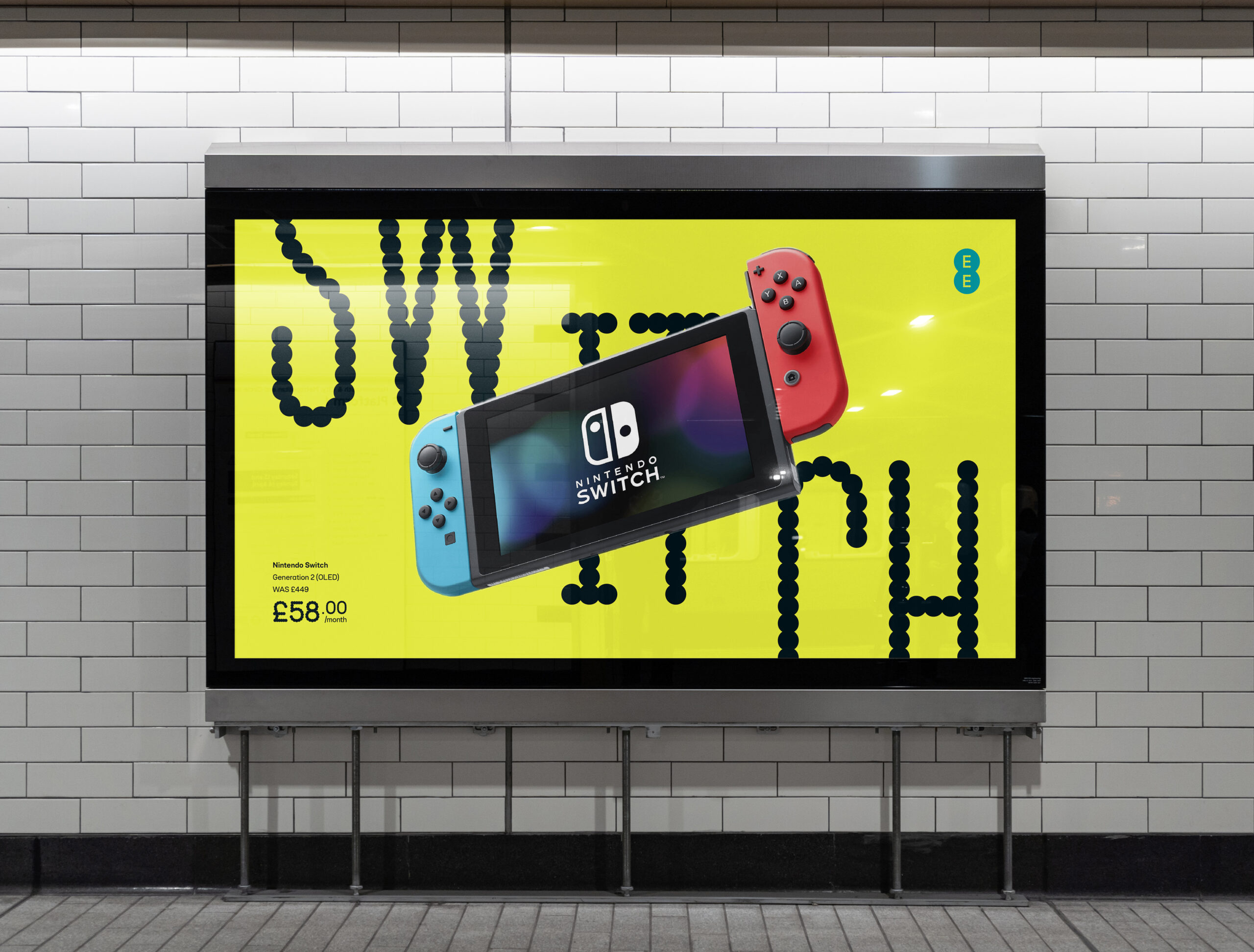
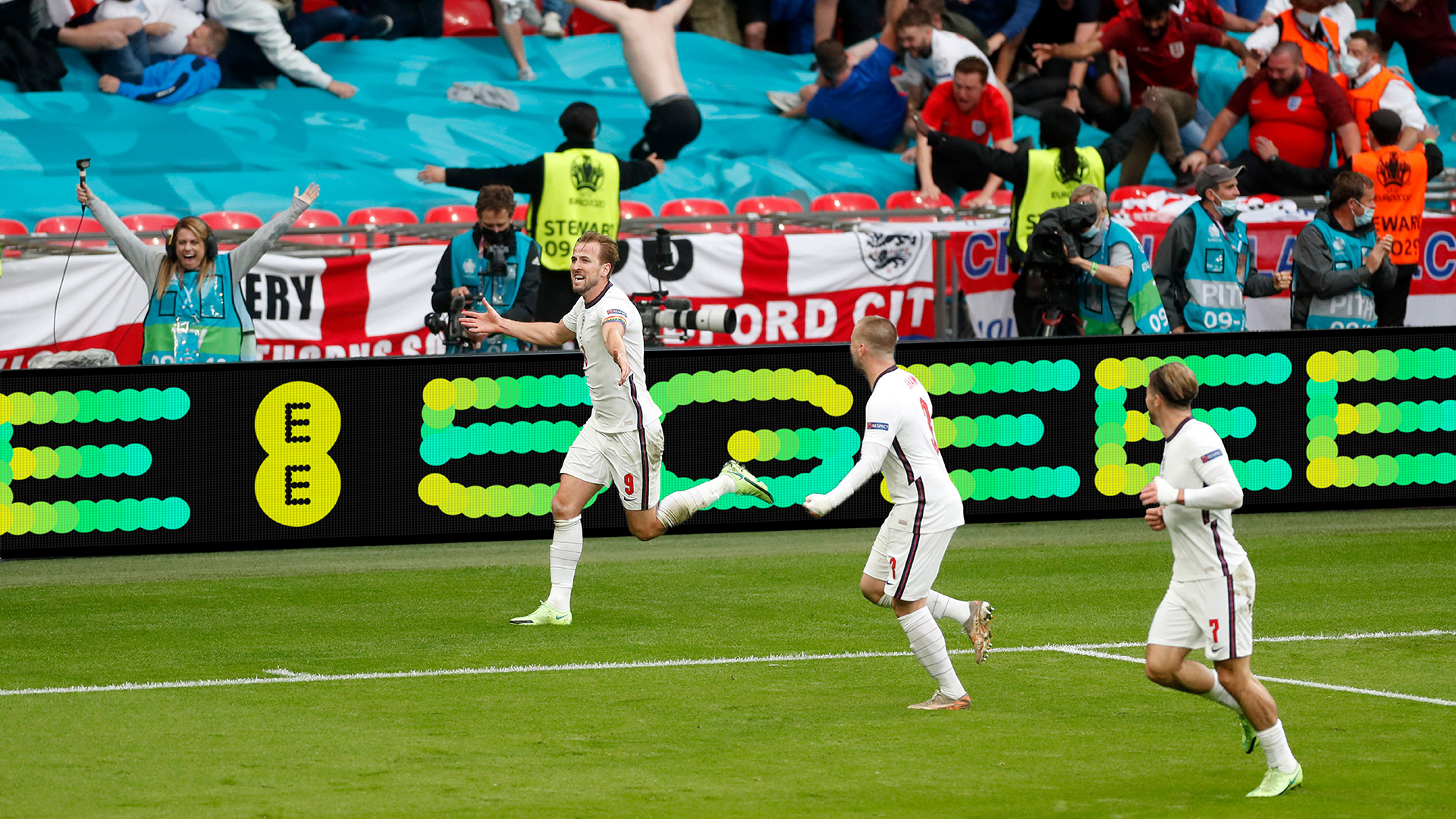
We opted to retain the idea of a super recognisable display typeface constructed from dots. We collaborated with Colophon Foundry to develop "Dottee" in 3 weights and widths, alongside an architectually identical functional typeface which drew it's curvy inspiration from our physical product DNA developed by product designer Tej Chauhan.
We then designed a range of "Dottee FX" behaviours which brought a dynamism to the brand which previously wasn't there.
We designed a future-proof digital vision.
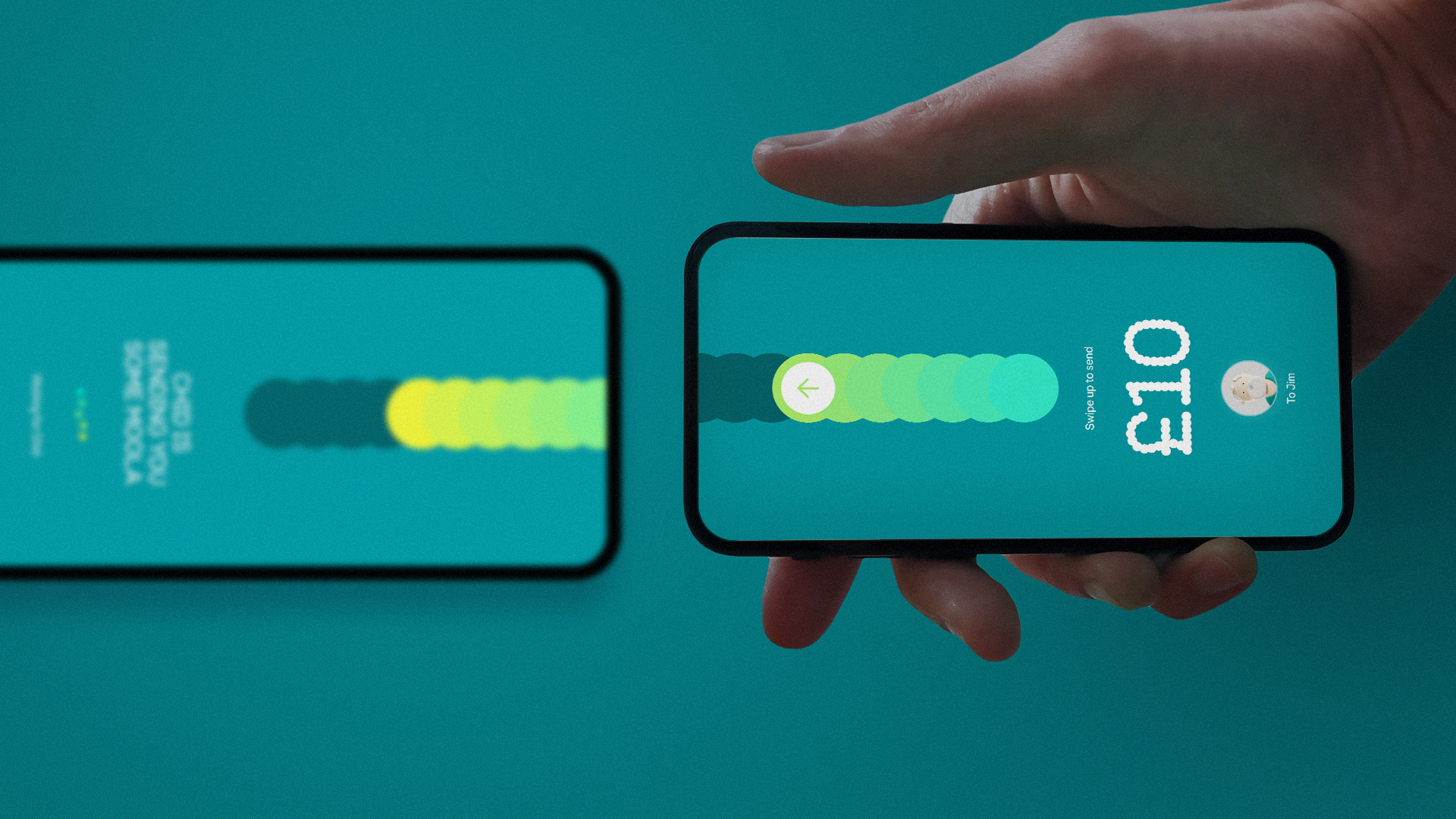
Working alongside all of EE’s internal teams and partners, we adapted the identity into distinctive channel experiences, including working closely with the digital squads to design a future-facing digital north star covering UI language and ownable digital behaviors.
"Hey Aimee."
We introduced Aimee to the world, giving customers a new way to interface with the brand. Taking brand bots beyond chat, we invisioned a world where Aimee could help you through the buying process, recommend usefull actions on your existing account, run your smart home and so much more.
Product design &
EE's beating heart.
We defined the product DNA of the brand by its physical hardware form, with principles of continuous curves, formal contrast, all with a consistent, functional EE heart. The latest products are just the start of this direction and the realisation of our collaboration with Tej Chauhan
All the feels.
The new brand identity comes with a sensory upgrade complete with a full sonic library, bringing EE’s playful but leading, rabble-rousing personality to life. We defined materials and haptic behaviours to build distinction through touch and developed a scent for use in retail and experiential scenarios.
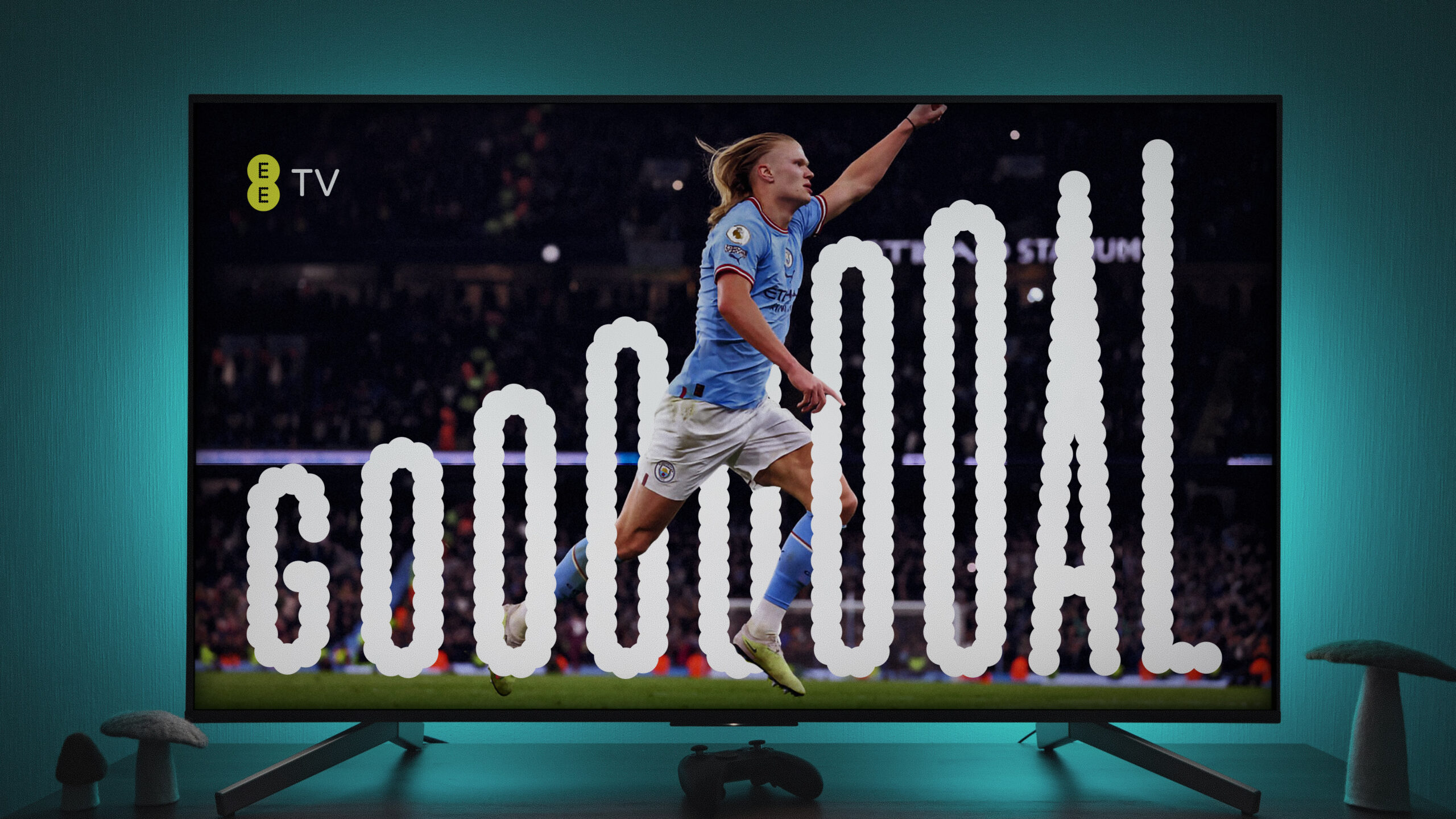
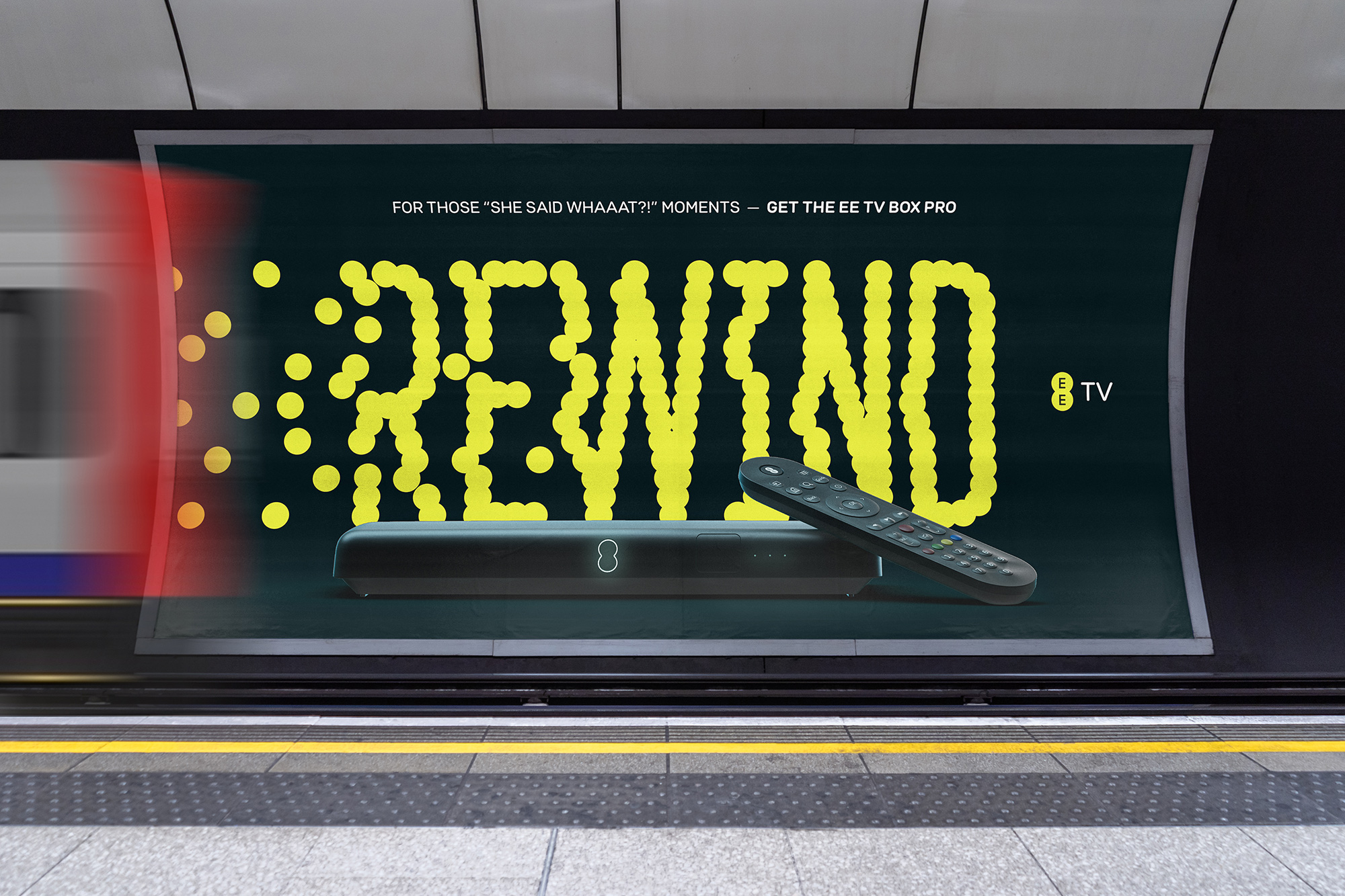
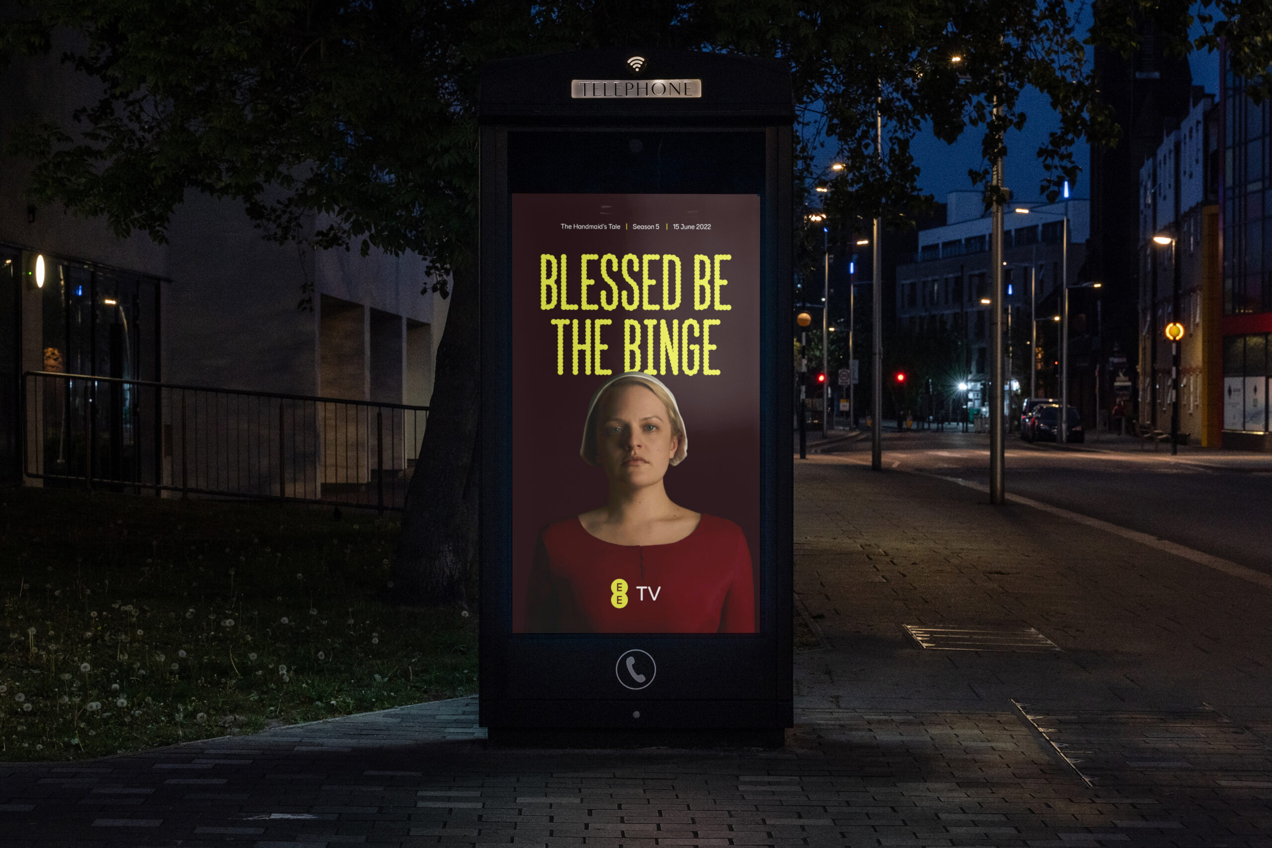
Introducing EE TV. Content-led brand emmersion.
After building a brand that could flex and talk authentically to new categories, EE wanted to launch their all-new TV offering. Leaning into our "immersive" brand mode - using a darker pallet and content-masking frame asset, we let the content viewers cared about take the lead while the brand played a more subdued bookending role.
Awards are always nice.
✦ Gold: Brand Impact Awards 2024
“Evolution perfected. Flawless execution, impactful design, and a system built for success.” - Heitor Piffer – Design Bridge & Partners (Judge)
✦ Gold: Transform Awards Europe 2025
Best Visual Identity from the Technology, Media and Telecommunications Sector.
Back to work ↩︎