001
-
BT GROUP | EE BRAND REFRESH
Reinventing a household name for edgeless growth.
The BT group had ambitions of being the most personal and customer-focused technology brand in the UK. Their mobile focused brand EE needed a host of new tools to relaunch with a bigger, broader, bolder offering for customers, there are focus areas around Home, Work, Game and Learn and early propositions around home security, enhanced TV services, new network personalisation technologies and a new gaming destination.
Media error: Format(s) not supported or source(s) not found
Download File: https://danielormedesign.com/wp-content/uploads/2024/07/EE_WebCaseStudy_00_HomepageThumb.mp4To support these growth ambitions now and next, we boosted the brand with dialled-up distinctiveness and the extra elasticity needed to cut through in new categories.
We took the brand back to its core component, the smart dot, and gave it a new, simpler aesthetic and defined new behaviours to allow the brand as much playful, multi-channel utility as possible.
Media error: Format(s) not supported or source(s) not found
Download File: https://danielormedesign.com/wp-content/uploads/2024/07/Desktop-1.mp4Suddenly, EE could flex and express itself in new ways to new audiences.
We opted to retain the idea of a super recognisable display typeface constructed from dots. We collaborated with Colophon Foundry to develop "Dottee" in 3 weights and widths, alongside an architectually identical functional typeface which drew it's curvy inspiration from our physical product DNA developed by product designer Tej Chauhan.
We then designed a range of "Dottee FX" behaviours which brought a dynamism to the brand which previously wasn't there.
Media error: Format(s) not supported or source(s) not found
Download File: https://danielormedesign.com/wp-content/uploads/2024/07/Desktop-2.mp4Media error: Format(s) not supported or source(s) not found
Download File: https://danielormedesign.com/wp-content/uploads/2024/07/Wakey-laptop.mp4Future-proof digital vision.
Working alongside all of EE’s internal teams and partners, we adapted the identity into distinctive channel experiences, including working closely with the digital squads to design a future-facing digital north star covering UI language and ownable digital behaviors.
Media error: Format(s) not supported or source(s) not found
Download File: https://danielormedesign.com/wp-content/uploads/2024/07/Desktop-3.mp4Media error: Format(s) not supported or source(s) not found
Download File: https://danielormedesign.com/wp-content/uploads/2024/07/Mobile.mp4Product design. EE's beating heart.
We defined the product DNA of the brand by its physical hardware form, with principles of continuous curves, formal contrast, all with a consistent, functional EE heart. The latest products are just the start of this direction and the realisation of our collaboration with Tej Chauhan
All the feels.
The new brand identity comes with a sensory upgrade complete with a full sonic library, bringing EE’s playful but leading, rabble-rousing personality to life. We defined materials and haptic behaviours to build distinction through touch and developed a scent for use in retail and experiential scenarios.
Credit: Father and Keshins co
Media error: Format(s) not supported or source(s) not found
Download File: https://danielormedesign.com/wp-content/uploads/2024/07/Sensory-Mobile.mp4Media error: Format(s) not supported or source(s) not found
Download File: https://danielormedesign.com/wp-content/uploads/2024/07/EETV-2024-ZAG-Talk-To-Search-006.mp4EE TV. Content-led brand emmersion.
We had already built a brand that could flex and talk authentically to new categories, so when EE launched their all-new TV offering we were ready. We leaned into our immersive brand mode, using a darker pallet and content masking asset, we let the content viewers cared about take the lead while the brand played a more subdued bookending role.
Media error: Format(s) not supported or source(s) not found
Download File: https://danielormedesign.com/wp-content/uploads/2024/07/EETV-2024-ZAG-20240426-1300-Poor-Things-008.mp4Media error: Format(s) not supported or source(s) not found
Download File: https://danielormedesign.com/wp-content/uploads/2024/07/EE_3D_TEXT_GALLERY_SV_V29_RS_Camera_2_0000-0350-2-1.mp4Media error: Format(s) not supported or source(s) not found
Download File: https://danielormedesign.com/wp-content/uploads/2024/07/Beast-Mode.mp4CREDITS:
Agency: ZAG
My role: Senior Brand Designer (Freelance 3+ years)
CD: Neil Cummings & Daniel Green
Product design partner: Tej Chauhan
Sound design partner: Father
Type design partner: Colophon
Illustration partner: P.I.C studio
Animation development: SR partners, Rich Coldicott, Liam Corner, Matt Fowler
Scent design: Prosody London
Haptic design: Goya Studio
CREDITS:
Agency: ZAG
My role: Senior Brand Designer (Freelance 3+ years)
CD: Neil Cummings & Daniel Green
Product design partner: Tej Chauhan
Sound design partner: Father
Type design partner: Colophon
Illustration partner: P.I.C studio
Animation development: SR partners, Rich Coldicott, Liam Corner, Matt Fowler
Scent design: Prosody London
Haptic design: Goya Studio
002
-
TIKTOK MAGAZINE
The world's biggest digital platform...goes to print.
TikTok wanted a physical marketing tool to highlight what makes it so appealing for brands. I was brought onto the in-house team to design a printed magazine that stayed true to the platform and its creators, while demonstrating the reach and impact the app has for brands.
Naturally, we selected a 9:16 format and used real TikTok camera effects and filters to create bespoke typographic treatments. The cover image was digitally encoded to be detected by the app QR code scanner which launched a secret () 3D cover experience, as well as unique codes on various pages launching readers directly into content/ creators on the app.
002
-
TIKTOK Magazine
The world's biggest digital platform...goes to print.
TikTok wanted a physical marketing tool to highlight what makes it so appealing for brands. I was brought onto the in-house team to design a printed magazine that stayed true to the platform and its creators, while demonstrating the reach and impact the app has for brands.
Naturally, I selected a 9:16 format and used real TikTok camera effects and filters to create bespoke typographic treatments. The cover image was digitally encoded to be detected by the app QR code scanner which launched a secret () 3D cover experience, as well as unique codes on various pages launching readers directly into content/ creators on the app.
003
-
ADDITIONAL WORK
The following is a selection of older work from various projects.
Let's talk
about our
next project
together.
Let's talk about our next project together.
Email: danielormedesign@gmail.com
Mobile: +44 (0) 7368 611533
Email: danielormedesign@gmail.com
Mobile: +44 (0) 7368 611533
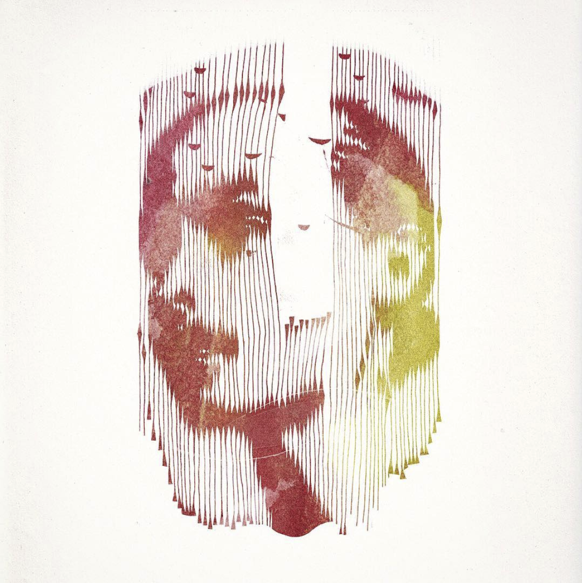
36 Days of type project - One letter every day for 36 days.